


Analysis of MAD2 using PCA, tICA, and Markov State Models
By Elizabeth Sebastian and Alberto Perez
University of Florida, Gainesville, FL
TABLE OF CONTENTS
ConclusionReferences
Implementation of methods outlined in:
Scherer, M. K.; Trendelkamp-Schroer, B.; Paul, F.; Pérez-Hernández, G.; Hoffmann, M.; Plattner, N.;
Wehmeyer, C.; Prinz, J.-H.; Noé, F. PyEMMA 2: A Software Package for Estimation, Validation, and
Analysis of Markov Models. J. Chem. Theory Comput. 2015, 11 (11), 5525–5542.
https://doi.org/10.1021/acs.jctc.5b00743.
Introduction
Metamorphic proteins can switch between dramatically
different conformations, often having incredibly
different functions.1 While for some proteins
these switches are affected by the factors such as binding
or pH, others are able to access these alternative
structures at equilibrium. These proteins have
many applications due to their ability to have multiple
functions. As such, it is useful to understand how AMBER
can connect with state based analysis methods to examine
these sorts of secondary
structure changes.2
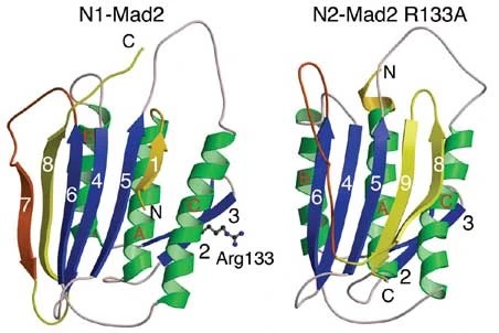
Figure 1. Two conformations of metamorphic protein MAD2 (image taken from
reference 3)
The metamorphic protein used in the following tutorial is the MAD2 Spindle checkpoint protein,
which
can adopt two different native conformations (Figure 1).
Notable changes in this structure include:
the movement of beta pleat 8
the loss of beta pleat 9
and the formation of beta pleats 7 and 1
The change in conformation is important in spindle checkpoint signaling.3
For metamorphic proteins,
understanding how the energy landscape is explored is important in understanding changes in the
protein structure.
This tutorial will use:
Principal component analysis (PCA) and time-lagged independent component analysis (tICA) to
create projections of the energy landscapeMarkov state models (MSM) to understand transition dynamics of the system
In order to analyze the data, first a standard molecular dynamics simulation must be run and a
trajectory collected.
Process
Standard Molecular Dynamics Simulation of MAD2
1. Download and prepare the pdb file for Amber.
The N2 conformation has the PDB ID 1S2H
The PDB file was prepared using pdb4amber
pdb4amber -i 1s2h.pdb
You can get the cleaned pdb file here.
2. Use tleap to implement the following force fields:
ff14SB - protein
gaff - organic ligands
TIP3P - water
source leaprc.protein.ff14SB#Load protein ff99SB* backbone parameters with source leaprc.gaff
ff14 side chain parameters#Load the general amber force field (gaff) source leaprc.water.tip3p#Use the TIP3P water model mol = loadpdb 1s2h.pdb#Load PDB file for protein complex solvatebox mol TIP3PBOX 8#Solvate the complex with a cubic water box addions mol Na+ 0#Add ions to neutralize the system saveamberparm mol 1s2h.prmtop 1s2h.crd#Save AMBER topology and coordinate quit
files#Quit tleap program
You can get the topology and coordinate files at these links.
3. Run production run MD:
A 50 ns simulation was performed using a 2 fs
timestep and saving frames every 500 steps (10 ps).
Note: The simulation was later extended to 708.44 ns. The following
sections will display the results of
the analysis before
and after extension.
You can get the 50 ns simulation
here.
You can get the extended simulation here here.
Note: these trajectories are very large.
Analysis
In the following sections, PCA and tICA, two types of
dimension reduction methods, are used to analyze
motions
in the trajectories. Both methods transform sets of data
with a large number of variables into a
smaller set that
retains the majority of information in the original set.
PCA specifically looks for the
greatest change or
variance in movement over the system, while tICA looks
for the slowest motion.4
Both methods project the energy landscape onto the two first components,
but the meaning of the
vectors are different. In some scenarios
(eg. fast loop motion) the greatest change in the system is not
the
most relevant projection coordinate. By capturing the slowest dynamics,
tICA eigenvectors can be
more meaningful.
Both PCA and tICA have been chosen for the analysis of the 1s2h simulation to see
if both native
conformations of Mad2 protein can be sampled and identified. tICA is also very
useful, as it can be then
used to construct a Markov state model. Markov state models allow
for the identification of transitions
between multiple states, and an estimation of the
favorability of these transitions.4
This is very useful in
characterizing a protein which is able to access two different minima.
Note: Markov state models require the sampling of all the substates in the global state. Other state
based methods such as
Dynamic Graphical models or a hidden Markov
state model may be more
useful if it is known that the energy landscape
is not well explored. These methods establish ‘rules’
based
on observed sampling to identify states that are not directly sampled.
1. PCA analysis
PCA was performed using this input file
parm ../1s2h.prmtop#loading topology trajin ../md.nc#loading trajectory autoimage anchor @CA rms first @N,C,CA average @N,C,CA crdset trajaverage createcrd trajectory run#creating covariance matrix and projecting crdaction trajectory rms ref trajaverage @N,C,CA crdaction trajectory matrix covar name covmatrix @N,C,CA runanalysis diagmatrix covmatrix out evecs.dat vecs 10 name eigenvectors \
nmwiz nmwizvecs 10 nmwizfile normalmodes.nmd nmwizmask @N,C,CA crdaction trajectory projection modes eigenvectors beg 1 end 10 @N,C,CA out \
pca.dat crdframes 1,4999#this number changes depending on the number of quit clear all readdata evecs.dat name eigenvectors parm unboundstrip.top parmwrite out modes.prmtop runanalysis modes name eigenvectors trajout modes01.nc pcmin -150 pcmax 150 \
frames in your system
tmode 1 trajoutmask @N,C,CA trajoutfmt netcdf#the modes.prmtop can be read in a visualization software to ‘see’ the
motions that correspond to each primary component
This file can be run using the following command:
cpptraj -i ALL.in
This command will output a pca.dat file, which can then be
graphed along the first two primary components.
For more information on PCA see:
https://amber.utah.edu/AMBER-workshop/London-2015/pca/
The PCA analysis can be visualized using the following python script
The script is run using the following command:
python colormap.py pca.dat PCA pca.png
The resulting graph below shows two different clusters.
Each of these clusters represent an energy minima
that was identified during the simulation.
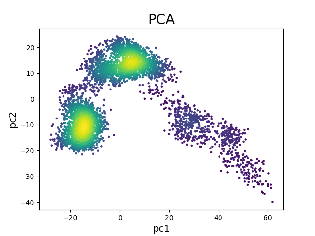
Figure 2. PCA projection of 50 ns simulation.
Using a text editor, frames of the simulation representing each cluster were
identified and turned into PDB
files using VMD.
You can obtain
these PDB files here:
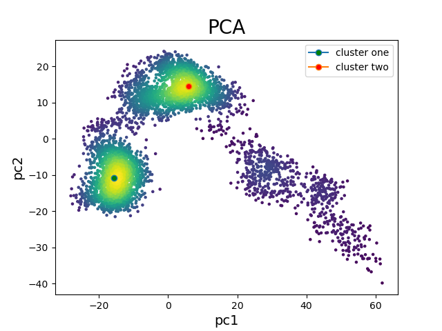
Figure 3. PCA projection of 50 ns simulation with identified clusters.
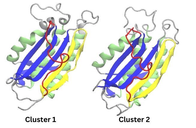
Figure 4. Cartoon representations of Cluster 1 and Cluster 2 from the 50 ns simulation
These structures in the figure above were colored to match the coloring of the conformations found in
the
original paper. It is clear that an interesting change is found in beta pleat 8 where a twist in the beta
pleat results in two
shorter beta pleats. The lack of the N1 conformation could be either due to a need for
greater
sampling or to the features examined in PCA analysis. As such,
it can be very useful to then use
tICA analysis as well.
1.2 PCA Extended
For the reasons stated above, the simulation was
extended. The following data utilized the same PCA
analyses, and are intended to show how
the increased simulation time has impacted the energy
landscape.
The image below shows the PCA projection and the position of the selected frames for each cluster.
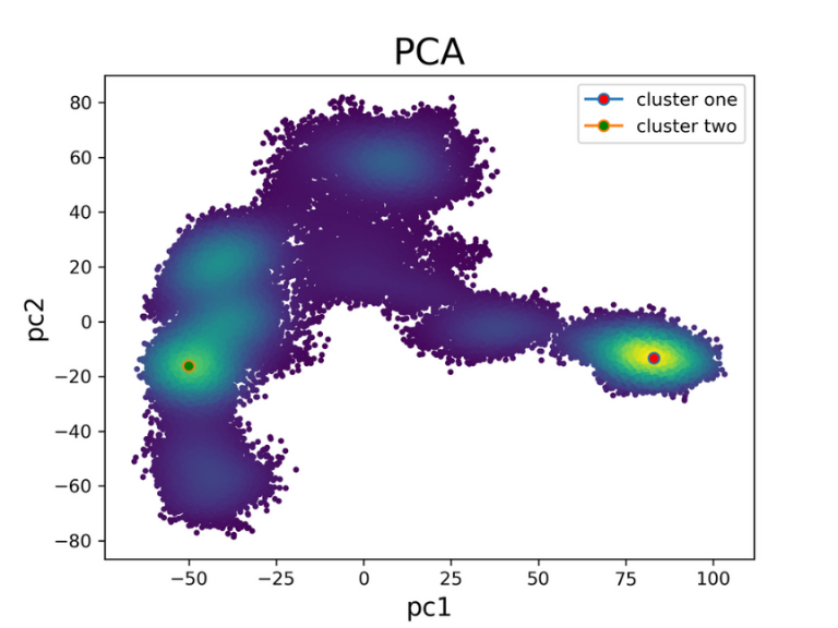
Figure 5. PCA projection of extended simulations with identified clusters
As expected, the increased simulation time has led to a greater exploration of the energy landscape.
The two clusters that were identified are visualized below.
Interestingly, cluster one appears to be favored
over cluster two.
You can obtain
these PDB files here:
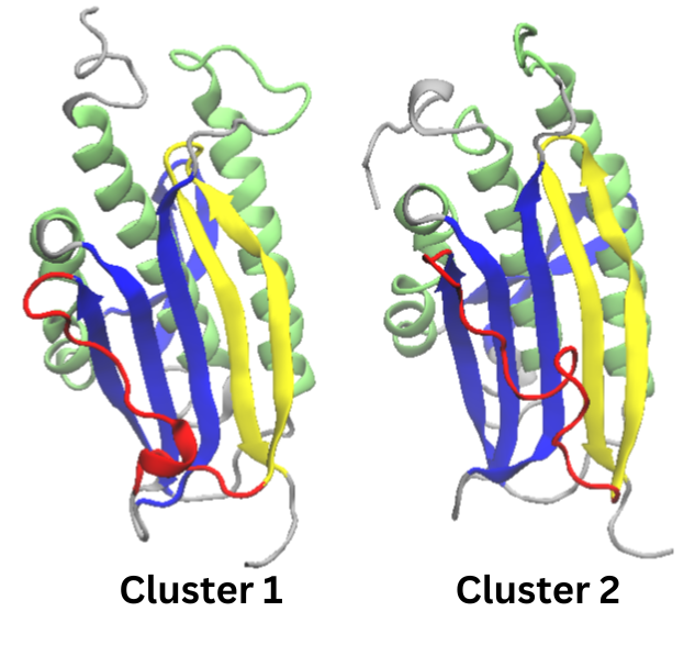
Figure 6. Cartoon representations of the identified clusters in the extended simulation
Cluster two seems to be the same as cluster two in the original 50 ns simulation. Cluster one still has the
turn in beta pleat 8 found in
cluster 2. The main difference between the twin clusters is
an alpha helix in the
red section (which is beta
pleat 7 in the N1 conformation). Neither one of these
structures represent the N2
confirmation. A different experimental design may be needed to access that state.
2. Secondary Structure Analysis with CPPTRAJ
For metamorphic proteins, changes in secondary structure
are of the utmost importance in understanding the
ways
the dynamics behind the energy landscape. Luckily, CPPTRAJ
has a built-in method for extracting
secondary structure.
The following input file
was used to calculate the secondary structure:
parm ../1s2h.prmtop
trajin ../md.nc
secstruct  out ss_per_res_y.dat sumout dssp_y.dat totalout total_y.out
go
quit
The total_y.out file gives the secondary
structure of each residue in the structure per each frame.
The
dssp_y.dat gives information about the
percentage of each type of secondary structure (extended,
bridge,
helix, turn or bend) each residue has over the total simulation time.
You can obtain both of these files below:
The dssp_y.dat data can be plotted using the following python script:
import numpy as np
from matplotlib import pyplot as plt
data =np.loadtxt("dssp_y.dat")
resid = data[:,0]
extended=data[:,1]
bridge=data[:,2]
three=data[:,3]
alpha=data[:,4]
pi=data[:,5]
turn=data[:,6]
bend=data[:,7]
helix = [0]*len(pi)
for i in range(len(pi)):
    b=three[i]
    c=alpha[i]
    d=pi[i]
    helix[i]=b+c+d
other=[0]*len(pi)
for i in range(len(pi)):
    e=bridge[i]
    f=turn[i]
    g=bend[i]
    other[i]=e+f+g
fig,ax=plt.subplots(3,1,sharex=True, sharey=True)
ax[0].plot(resid,extended,label='Extended')
ax[0].set_ylabel('Extended')
ax[1].plot(resid,helix,label='Helix')
ax[1].set_ylabel('Helix')
ax[2].plot(resid,other,label='Other')
ax[2].set_ylabel('Other')
fig.text(0.52,0.01,'Residues',ha='center')
fig.text(0.001,0.5,'Percentage',va='center',rotation='vertical')
#fig.ylabel('Percentage of Time')
plt.tight_layout()
plt.savefig('./ss_per_res_subplts.png',dpi=300)
This script will output the lifetime percentage for alpha, beta, and other secondary
structures for each
residue on multiple subplots.
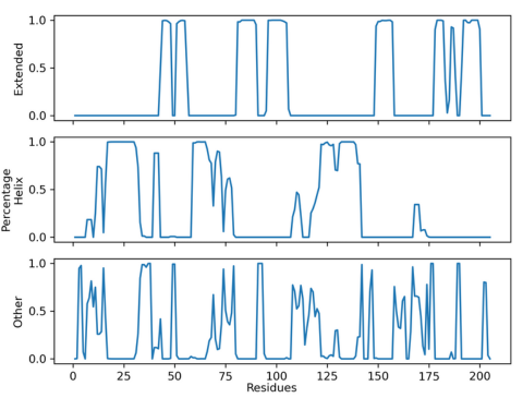
Figure 7. Lifetime Secondary Structure Plot of 50 ns simulation
From the plot above, a couple things can be determined. Firstly, that the first beta
pleat of the N1
conformation was not found in the
simulation. The region that would normally contain that
beta pleat has
mostly either a helix or an amorphous
secondary structure. Beta pleat 7 is also not found as
there is no
beta structure in the
residue range of 160-175. Secondly, there is further
confirmation of PCA results
where beta pleat 8 was seen splitting into two beta pleats.
2.2 CPPTRAJ analysis with extended simulation.
The plot below shows the result of using the above CPPTRAJ analysis on the extended simulation.
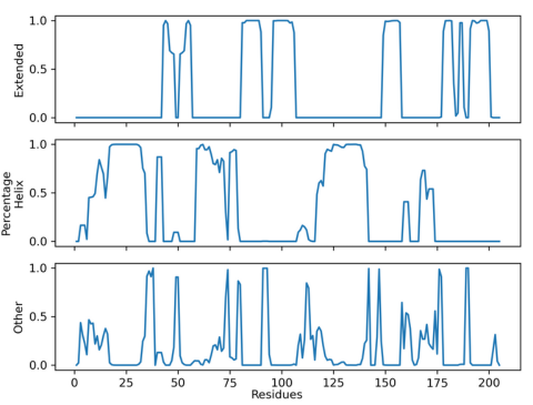
Figure 8. Lifetime secondary structure plot of extended simulation
This plot is extremely similar to the plot seen above proving that the extended
simulation did not identify
the N1 conformation. At this
point, if you were interested in identifying the
N1 conformation, it would be
best to reconsider the
experimental design, as a tICA project or MSM will
only extract structures that are
present in the
simulation. For the purposes of understanding how these
analyses work, however, this case
study will continue.
3. tICA Analysis and MSM Construction
The tICA Analysis that was performed using PyEMMA,
a free python library. For more information on how
to
use PyEMMA, and some techniques that aren’t
covered here please refer to the PyEMMA tutorials
here:
http://www.emma-project.org/latest/tutorial.html.
Many of the choices made depend on the specific
system
used. For the first time using PyEMMA, it is highly
recommended to use jupyter notebook so that
you can quickly make adjustments in choice of variables as you see the results of your analysis.
The normal methodology for performing tICA analysis is seen
in blue. However, secondary information
from the total_y.out file will be added in between featurization and clustering.
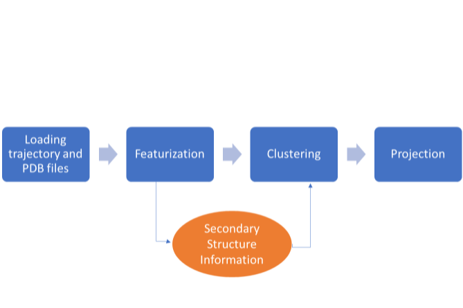
Figure 9. Methodology for tICA
3.1 Loading Files
PyEMMA requires that trajectory information is inputted
in the GROMACS .xtc format. In CPPTRAJ, you
can convert into the correct format like this:
parm 1s2h.prmtop
trajin md.nc
trajout md.xtc
go
quit
After obtaining the trajectory file in the
correct format, you can then begin inputting the
trajectory and pdb
files as such in python:
#loading python libraries import pyemma pyemma.__version__ import numpy as np import glob import pyemma.coordinates as coor import pyemma.msm as msm import pyemma.plots as mplt import matplotlib matplotlib.use('Agg') from matplotlib import pyplot as plt import pyemma.coordinates as coor import sys import shutil import os from pyemma.util.contexts import named_temporary_file import matplotlib.cm as cm from collections import defaultdict#loading files trajfile = [] trajfile.append('md.xtc'.format()) isfile = [os.path.isfile(f) for f in trajfile] trajfile = np.array(trajfile)[isfile] trajfile = trajfile.tolist() topfile = 'original.pdb'#Get names of the trajectory files and topology files and save to np.savez('trajectory_files.npz',files=trajfile,top=topfile) traj_npz = np.load('trajectory_files.npz')
metatrajectory#technically unnecessary unless you trajfile = traj_npz['files'].tolist() topfile = str(traj_npz['top'])
are doing this step in multiple parts
3.2 Featurization
Selecting features, is annoyingly, more of an art than a
science. The features selected in this tutorial are
not necessarily the best way to featurize the
system, but they do identify a Markovian process and
provide useful information for understanding the energy
landscape. For your system, you will need to
think
about what structural motifs will provide the most
information about the system’s molecular
dynamics
while trying to avoid noise and reduce computational cost.
In this case, the minimum
Root Mean Square Deviation
(RMSD) and the minimum distances between pairs of residues
in beta pleats
6 and 8 were chosen. These beta pleats
are next to each other in the N1 conformation but farther
away
from each other in the N2 conformation. The following code was inputted after the code in
3.1.
feat = coor.featurizer(topfile) feat.add_minrmsd_to_ref(topfile)#minimum RMSD region_1 = [i for i in range(178,188)]#beta pleat 8 region_2 = [i for i in range(148,158)]#beta pleat 6 pairs =[] for i in region_1: for j in region_2: if i>j: pairs.append([i,j]) pairs=np.array(pairs) feat.add_residue_mindist(pairs,periodic=False)#minimum distance between pairs X = coor.load(trajfile, feat)#save trajectory with features selected trans_obj = coor.tica(X,dim=2) Y = trans_obj.get_output()
3.3 Adding Secondary information
The following essentially takes the existing information
from the above step and adds the calculated
secondary
structure information from
section 2 as
columns.
Be careful as the column number (used later
in section 3.5) will change depending on the
system and features used, which is needed for slicing later
on. The addition of columns will ensure that in the
clustering step, the frames selected for each cluster will
have
their corresponding secondary structure information attached.
data = np.loadtxt('total_y.out')
extended = data[:,1]
bridge = data[:,2]
three = data[:,3]
alpha = data[:,4]
pi =data[:,5]
turn = data[:,6]
bend = data[:,7]
helix = [0]*len(pi)
for i in range(len(pi)):
    b=three[i]
    c=alpha[i]
    d=pi[i]
    helix[i]=b+c+d
other = [0]*len(pi)
for i in range(len(pi)):
    b=bridge[i]
    c=turn[i]
    d=bend[i]
    other[i]=b+c+d
helix = np.array(helix)
beta = np.array(extended)
other=np.array(other)
x=np.hstack(Y)
x.shape
Y=np.column_stack((x,helix))
Y = np.column_stack((Y,beta))
Y = np.column_stack((Y,other))
3.4 Clustering
There are multiple methods of clustering which discretizes
the sample space. Depending on the type of
clustering
that you chose, you can explore well-explored portions
of the energy landscape or minimally
explored regions.
In this case, kmeans-clustering was chosen which focuses
on regions of high density.
For more information, it is recommended to look at the
PyEMMA Jupyter notebook tutorials.
ncluster = 1000
clustering = coor.cluster_kmeans(Y, k=ncluster, max_iter=200)
dtrajs = clustering.dtrajs
3.5 tICA Graphs with Secondary Structure Coloring
The following code shows how to graph the tICA
projection and colors this projection
according to the
percentage of each secondary
structure in the overall structure. This allows for the
visualization of
secondary structure changes over the
simulation and their correlation to the primary
components of the
tICA projection. It is adapted from an analysis performed in this paper:
Chang, L.; Perez, A. Deciphering the Folding Mechanism of Proteins G and L and Their Mutants.
J. Am. Chem. Soc. 2022, 144(32),14668–14677. https://doi.org/10.1021/jacs.2c04488>.
from matplotlib import pyplot as plt fig,ax=plt.subplots(1,4,figsize=(15,3), sharex=True, sharey=True) cc_x = clustering.clustercenters[:,0] cc_y = clustering.clustercenters[:,1] pyemma.plots.plot_free_energy(np.vstack(Y)[:, 0], np.vstack(Y)[:, 1],ax=ax[0],
cbar=True) ax[1].scatter(cc_x,cc_y,c=clustering.clustercenters[:,2],cmap='gnuplot',
marker='o',vmin=0,vmax=0.6)#creates scatterplot of the cluster centers with ax[1].set_xlabel('Helix') ax[2].scatter(cc_x,cc_y,c=clustering.clustercenters[:,3],vmin=0,vmax=0.6,
their associated helical content
cmap='gnuplot',marker='o')#creates scatterplot of the cluster centers with ax[2].set_xlabel('Beta') c=ax[3].scatter(cc_x,cc_y,c=clustering.clustercenters[:,4],cmap='gnuplot',
their associated beta content
marker='o',vmin=0,vmax=0.6)#creates scatterplot of the cluster centers with ax[3].set_xlabel('Other (includes bend, turn, and none)') plt.colorbar(c,ax=ax[3]) plt.tight_layout() plt.savefig('./ss_colored.png',dpi=300)
their associated bend, turn, and unformed content
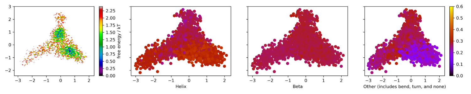
Figure 10. Energy landscape colored by secondary
structure percentage. 0.6 to 0.5 is yellow, 0.5 to 0.4 is
orange, 0.4 to 0.3 is red, 0.2 to 0.1 is blue, and 0.0 is black.
Similar to the PCA graph, the tICA graph above
shows the presence of two energy minima.
For the colored
tICA projection, there was an
increase in helical structure that corresponded to a
decrease in unformed
structure. The beta percentages
stayed roughly the same throughout the simulation.
This lack of beta structure
transition further confirms
the CPPTRAJ secondary structure plot result that the
simulation did not capture a
transition from the N2 to N1
conformation. If you were to see a transition, you would be
likely to see a section
of the projection to remain at
0.3 and another section that would be distinctly higher
(it would look more
yellow). As expected, t
hese secondary state changes correspond with the
slow dynamics of the simulation,
specifically with primary component 2.
3.6 Markov State Models
One of the questions that
computational chemists would often like to answer
when dealing with multiple
minima is whether one minima
is more favorable. Markov State Models (MSM) can allow
us to answer this
question when combined with the
Mean First Passage Time (MFPT) of each
transition.5
However, prior to
these calculations the
processes need to be validated as Markovian. If it is not
Markovian (it is not a memoryless
transition), then
other analytical methods will be more appropriate.
Note:The following validation test does not test
the validity of the tICA projection. tICA and MSM are two
different
analyses, but an MSM can be constructed from a tICA projection.
To save time, the following code loads the calculated features from
section 3.2 instead of
recalculating everything.
This will not contain the
secondary structure information that was previously loaded
in, and it will cluster the data
again.
X = coor.load(trajfile, feat)
trans_obj = coor.tica(X)
Y = trans_obj.get_output()
ncluster = 1000
clustering = coor.cluster_kmeans(Y, k=ncluster, max_iter=200)
dtrajs = clustering.dtrajs
You will then need to choose an appropriate lagtime.
The following code will estimate MSMs at different lag
times and calculate how the implied timescales (ITS) behave.
These are the relaxation timescales of the
system, and are a physical property of the system. As
such, the ITS should be independent of (and slower
than) the chosen lag time if the system is converged and truly Markovian in its dynamics.
its = pyemma.msm.its(dtrajs, lags=[1, 2, 5, 10], errors='bayes')
pyemma.plots.plot_implied_timescales(its, units='step')
plt.savefig("its.png",dpi=300)
The resulting graph is below:
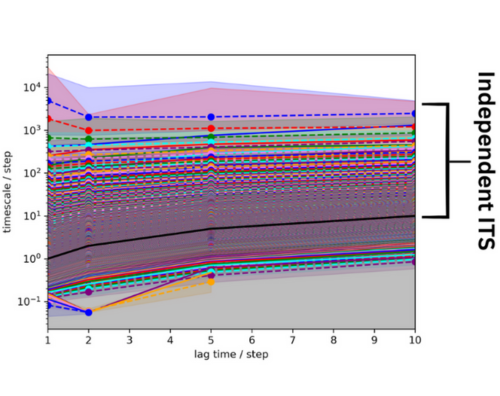
Figure 11. Implied time scales of the 50 ns system. The lag time is black and an bracket indicates the
independent ITS.
From this graph, it appears that there are many ITS slower than the MSM lag time (in black). The ITS seem to
be relatively resolved after two steps, so a lag time of 2
was chosen for the MSM estimation.
The code for this estimation is below:
M = msm.estimate_markov_model(dtrajs,2)
To better identify the number of transitions in the global state, the following graph was made using this code:
plt.plot(M.timescales(), linewidth=0, marker='o')
plt.xlabel('index')
plt.ylabel('timescale)
plt.savefig('./implied_timescale_spectral_analysis.png')
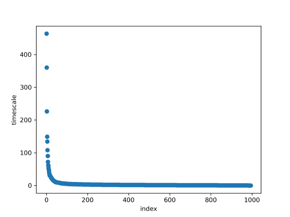
Figure 12. Implied timescales separation per index and timescale
It appears that there are three clearly separated timescales. These represent
transitions from state to state. This
means that the global system can be
separated into four states. The validity of the
estimated MSM will be tested
by performing a
Chapman-Kolmogorov test. Simply put, this test compares a
quantity at lag time kτ predicted by
the MSM at lag
time τ, with a MSM estimated at kτ. If the MSM doesn’t pass
this test, the underlying dynamics
cannot be assumed to be Markovian.
This following code was used to perform this test:
pyemma.plots.plot_cktest(M.cktest(4))
plt.savefig('./cktest.png')
This is the resulting graph.
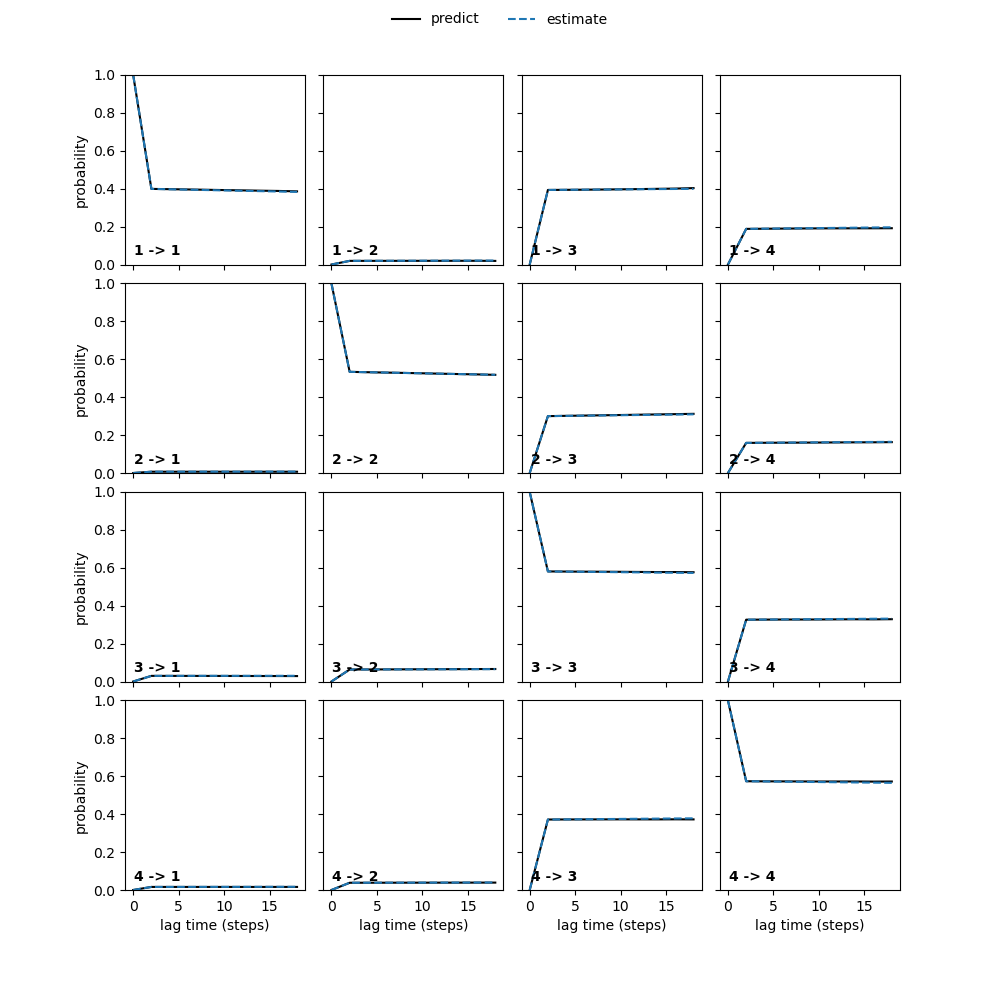
Figure 13. CK test of the 50 ns simulation
Good news! The Markov state model is valid.
Some code will be run to
determine the kinetic resolution of the MSM:
print('fraction of states used = ', M.active_state_fraction)
print('fraction of counts used = ', M.active_count_fraction)
This resulted in values of:
fraction of states used =  0.996
fraction of counts used =  0.9982
This means that while the MSM is valid, its kinetic resolution is
not 100%. One of the easiest ways to fix this is
to extend the simulation, so you have more data to
play with. The extended simulation will be shown below.
This case study will continue on to explore the
transitions between each state. The next step is to add a PCCA
distribution.
This will split the energy landscape into four substates using the code below:
nstates=4
M.pcca(nstates)
pcca_dist = M.metastable_distributions
A PDB file can be saved for each of the substates using the code below. You can find these PDB files here.
pcca_samples = M.sample_by_distributions(M.metastable_distributions, 1)
torsions_source = pyemma.coordinates.source(trajfile, feat)
pyemma.coordinates.save_trajs(torsions_source,pcca_samples,
    outfiles=['pcca{}-samples.pdb'.format(n + 1)
              for n in range(M.n_metastable)])
These PDB files will be visualized after graphing the
transitions between the different subsystems. The MFPT
and the inverse MFPT can be calculated to describe the
favorability of these transitions. The following code will
perform these calculations and create a table to display the transitions.
from itertools import product
mfpt = np.zeros((nstates, nstates))
for i, j in product(range(nstates), repeat=2):
    mfpt[i, j] = M.mfpt(
        M.metastable_sets[i],
        M.metastable_sets[j])
from pandas import DataFrame
mfpt = mfpt*100/1e6
inverse_mfpt = np.zeros_like(mfpt)
nz = mfpt.nonzero()
inverse_mfpt[nz] = 1.0 / mfpt[nz]
print('MFPT / ns:')
DataFrame(np.round(mfpt, decimals=2), index=range(1, nstates + 1),
columns=range(1, nstates + 1))
This is the resulting table:
MFPT/ns
| 1 | 2 | 3 | 4 | |
|---|---|---|---|---|
| 1 | 0.00 | 0.56 | 0.01 | 0.06 |
| 2 | 0.71 | 0.00 | 0.04 | 0.09 |
| 3 | 0.63 | 0.51 | 0.00 | 0.04 |
| 4 | 0.67 | 0.55 | 0.03 | 0.00 |
As you can see there are lower MFPT for states 3 and 4.
As MFPT is inversely correlated with speed of
transition between states, for the transition graph, the
arrow size was scaled with the inverse MFPT and the
arrows were labeled with the MFPT. Normally, you
can place this on top of a TICA graph with PCCA coloring,
very easily, but in this case it needed to be adjusted
due to the kinetic resolution. The following code slices
the inputted featurized information into
the same shape as the MSM information. The PCCA
distribution is then
used to color the tICA graph to show the distribution of each substate.
M.metastable_assignments.shape#used to figure out the splicing tica=Y[0] fig,ax=plt.subplots(1,4,figsize=(20,10), sharex=True, sharey=True) #ax.tick_params(direction="in", bottom=False, top=False, center=False, right=False) ax[0].scatter(tica[0:996,0][M.metastable_assignments==0],
tica[0:996,1][M.metastable_assignments==0])#the slicing was used to adjust the ax[0].set_xlabel('state 1',size=10) ax[1].scatter(tica[0:996,0][M.metastable_assignments==1],
size
tica[0:996,1][M.metastable_assignments==1],c='red') ax[1].set_xlabel('state 2',size=10) ax[2].scatter(tica[0:996,0][M.metastable_assignments==2],
tica[0:996,1][M.metastable_assignments==2],c='green') ax[2].set_xlabel('state 3',size=10) ax[3].scatter(tica[0:996,0][M.metastable_assignments==3],
tica[0:996,1][M.metastable_assignments==3],c='purple') ax[3].set_xlabel('state 4',size=10) plt.savefig('msm_cluster.png', dpi=300)
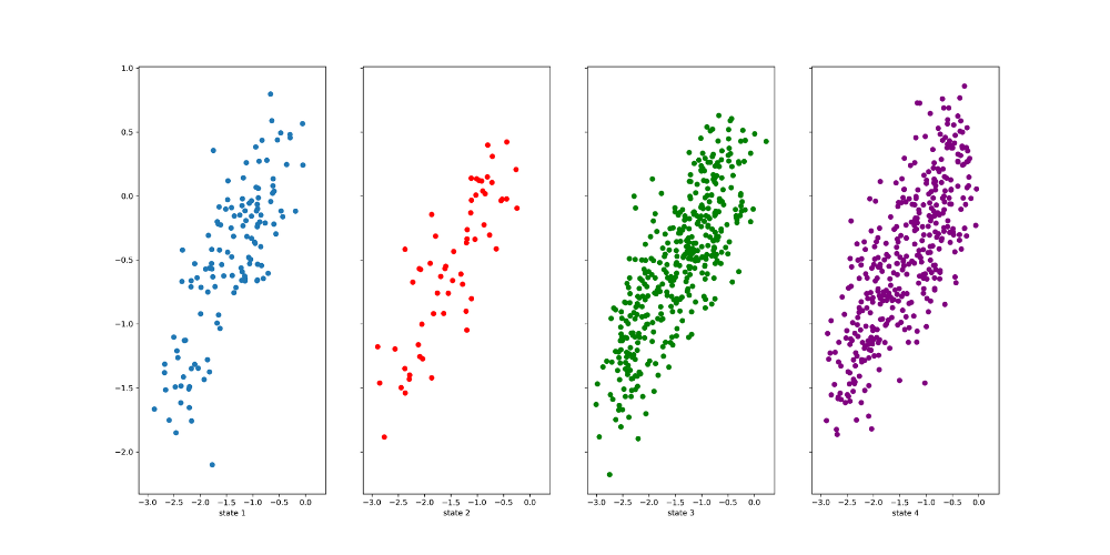
Figure 14. PCCA distribution of the 50 ns simulation
The image above shows that these states are not separated well from each other, as the clusters belonging
to
each state occupy the same parts of the feature space as those
belonging to others. This could be due to
the poor kinetic resolution. States 3 and 1 that interconvert
between each other very quickly may be the same
state.
Despite the poor separation, the case study will
continue to visualize the constructed Markov State Model
using the following code.
Note: Normally, if there is such poor separation
between states, it is not recommended to
continue to construct an MSM. The resulting information will not be very useful.
You can try to redo
the PCCA distribution with two
or three states using the
earlier code.
Extending the simulation can also be
helpful.
 #creates the transition graph
fig,ax=plt.subplots(1,1,figsize=(10,10))
tica_concatenated=np.concatenate(Y)
state_labels=['1','2','3','4']
highest_membership = M.metastable_distributions.argmax(1)
coarse_state_centers = np.array([[-.7, -1.5], [-2,.8],[-0.5,-0.1],[-2.7,-1.7]])
size = np.array([0.0005,0.0005,0.0005,0.0005])
colors=('b','r','g','m')
ax.set_xlabel('tica1')
ax.set_ylabel('tica2')
ax.set_xlim(tica_concatenated[:,0].min(), tica_concatenated[:,0].max())
ax.set_ylim(tica_concatenated[:,1].min(), tica_concatenated[:,1].max())
ax.scatter(tica[0:996,0][M.metastable_assignments==0],
tica[0:996,1][M.metastable_assignments==0],label='State 1',alpha=0.3)
ax.scatter(tica[0:996,0][M.metastable_assignments==1],
tica[0:996,1][M.metastable_assignments==1],c='red',label='State 2',alpha=0.3)
ax.scatter(tica[0:996,0][M.metastable_assignments==2],
tica[0:996,1][M.metastable_assignments==2],c='green',label='State 3',alpha=0.3)
ax.scatter(tica[0:996,0][M.metastable_assignments==3],
tica[0:996,1][M.metastable_assignments==3],c='purple',label='State 4',alpha=0.3)
pyemma.plots.plot_network(
    inverse_mfpt,
    pos=coarse_state_centers[:,:2],
    arrow_label_format='%.1f ns',
    arrow_labels=mfpt,
    arrow_scale=1.5,
    state_colors=colors,
    state_sizes=size,
    ax=ax,
    state_labels=range(1, nstates + 1),
    size=10,alpha=1);
plt.legend()
plt.savefig('transition_graph.png',dpi=300)
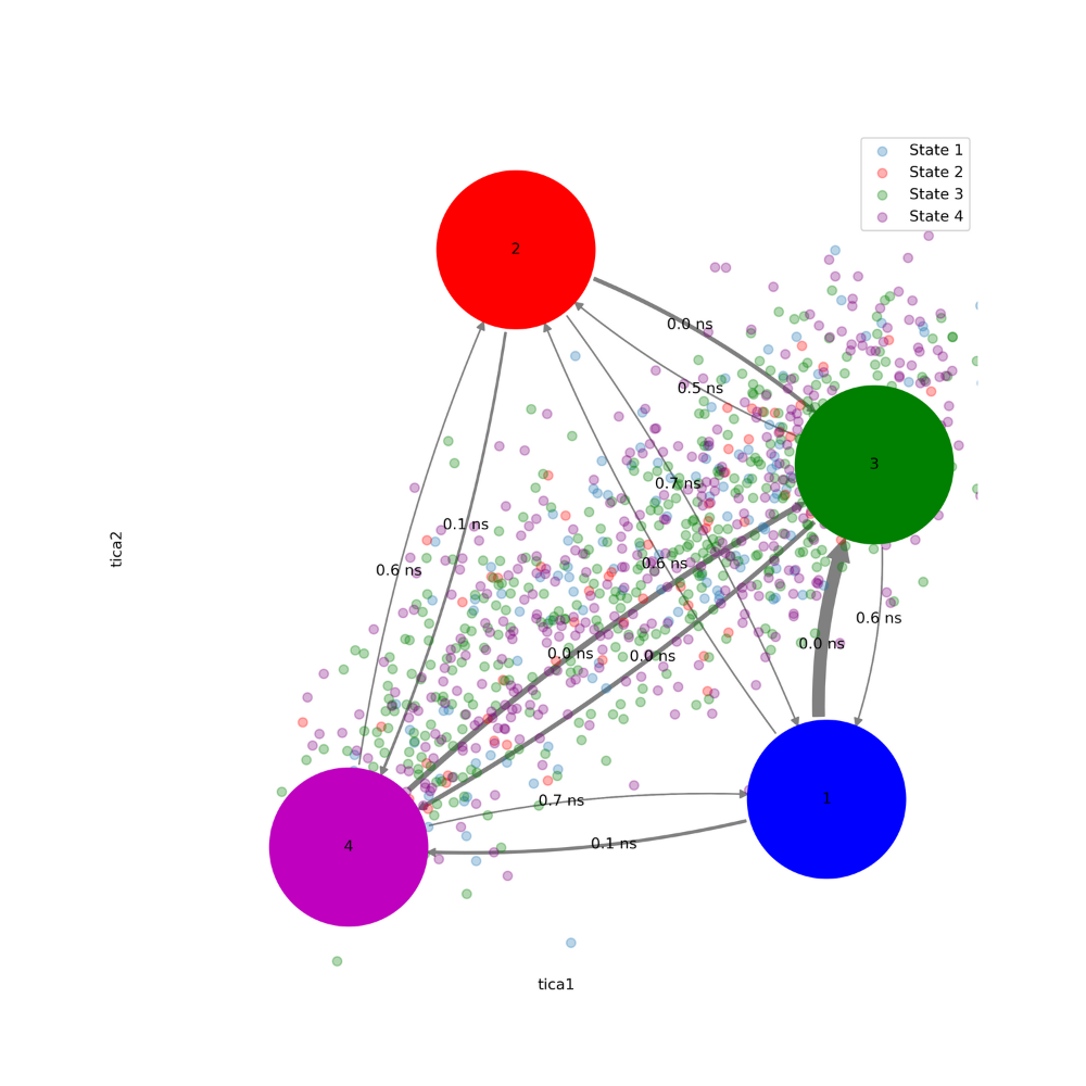
Figure 15. MSM of 50 ns simulation
This plot allows for the integration of the PCCA distribution and
MFPT in an interpretable manner. The
low MFPT
and poor separation, indicates that there are very few
differences between each of the states, and
that they may even be the same state. To check this, you can visualize the PDB files extracted earlier.
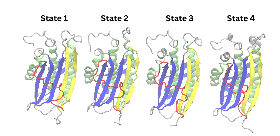
Figure 16. Cartoon representations of states extracted from PCCA distribution of 50 ns simulation
All of these states except for state 2 resemble the structure from the cluster 2 of the PCA, supporting that
this state is an
energy minima of the energy landscape. As expected, a
transition to the N1 conformation
is not seen, which indicates the need to extend the simulation time.
3.7 Extended Simulation tICA and MSM
With the extended simulation, the MSM had a kinetic
resolution of 1.0. That allowed for a clear separation
between states.
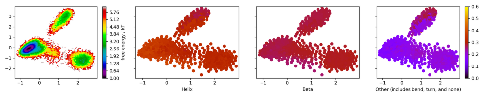
Figure 17. Energy landscape colored with
secondary structure percentages of the extended simulation.
0.6 to 0.5 is yellow, 0.5 to 0.4 is orange, 0.4 to 0.3 is red, 0.2 to 0.1 is blue, and 0.0 is black.
The tICA projection of the extended simulation clearly
shows three states with one state being favored.
Similar to the original simulation, increased helical
character corresponds with decreased unformed structure
along primary component two. Increased helical structure
also corresponds with a slight decrease in beta
structure along primary component one. The lowest energy
structure corresponds with the highest alpha
character, indicating that alpha helices are stabilizing.
The MSM was estimated with a lag time of 2.
This matches the protocol used earlier for the
original
simulation.
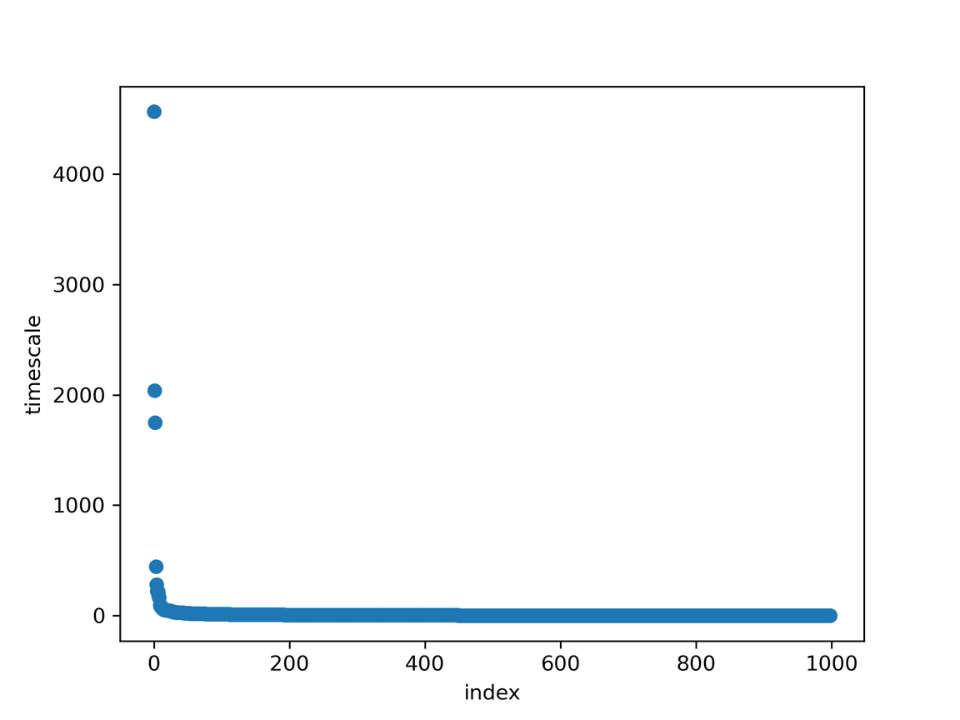
Figure 18. Separated ITS for extended simulation
While previously the implied timescales graph showed three
transitions, as per the graph above, there
are two well separated transitions. So the MSM will be
constructed with three states, which matches the
expectation
from the tICA projection.
The separation of states can be visualized using the following code:
dtrajs_concatenated=np.concatenate(dtrajs)
tica_concatenated=np.concatenate(Y)
M.pcca(3)
pcca_dist = M.metastable_distributions
metastable_traj = M.metastable_assignments[dtrajs_concatenated]
fig, ax = pyplot.subplots(figsize=(5, 4))
_, _, misc = pyemma.plots.plot_state_map(
    *tica_concatenated[:, :2].T, metastable_traj, ax=ax)
ax.set_xlabel('IC 1')
ax.set_ylabel('IC 2')
misc['cbar'].set_ticklabels([r'$\mathcal{S}_%d$' % (i + 1)
                             for i in range(3)])
fig.tight_layout()
plt.title('PCCA')
pyplot.savefig('Pcca.png',dpi=300)
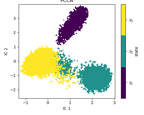
Figure 19. PCCA distribution of tICA projection of extended simulation
The benefit of a clearly separated energy landscape is
that the transitions between states now
establish meaningful correlations between steady-state
probabilities, the energy landscape and
secondary structure.
To validate this MSM, the CK-test is provided:

Figure 20. CK test of extended simulation
The transition graph was created using the following code.
It is projected over the PCCA graph to add
a visual demarcation of each state, and emphasize their separation.
state_labels=['0','1','2']
highest_membership = M.metastable_distributions.argmax(1)
coarse_state_centers =
clustering.clustercenters[M.active_set[highest_membership]]
fig, ax = plt.subplots(figsize=(15,15))
metastable_traj = M.metastable_assignments[dtrajs_concatenated]
_, _, misc = pyemma.plots.plot_state_map(
    *tica_concatenated[:, :2].T, metastable_traj, ax=ax, alpha =0.8, zorder=-1)
ax.set_xlabel('IC 1')
ax.set_ylabel('IC 2')
misc['cbar'].set_ticklabels([r'$\mathcal{S}_%d$' % (i + 1)
                             for i in range(nstates)])
pyemma.plots.plot_network(
    inverse_mfpt,
    pos=coarse_state_centers[:,:2],
    arrow_label_format='%.1f ns',
    arrow_labels=mfpt,
    arrow_scale=1.5,
    ax=ax,
    state_labels=range(1, nstates + 1),
    size=12,alpha=1);
ax.set_xlabel('tica1')
ax.set_ylabel('tica2')
ax.set_xlim(tica_concatenated[:,0].min(), tica_concatenated[:,0].max())
ax.set_ylim(tica_concatenated[:,1].min(), tica_concatenated[:,1].max())
plt.savefig("invMFPT.png",dpi=300)
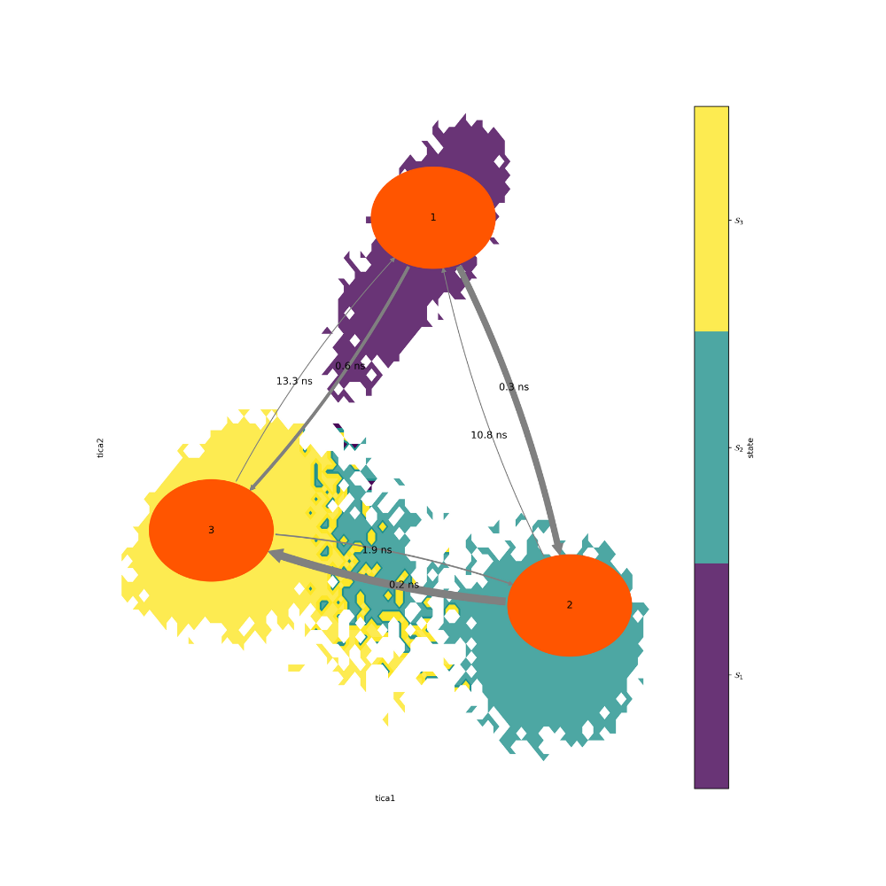
Figure 21. MSM of extended simulation
As expected from the tICA projection, state 3 has the lowest
MFPT. State 2 also seems to act as a
transition state for
the interchange from state 1 to state 3. The extracted PDB
can be visualized to develop
a better understanding of this transition.
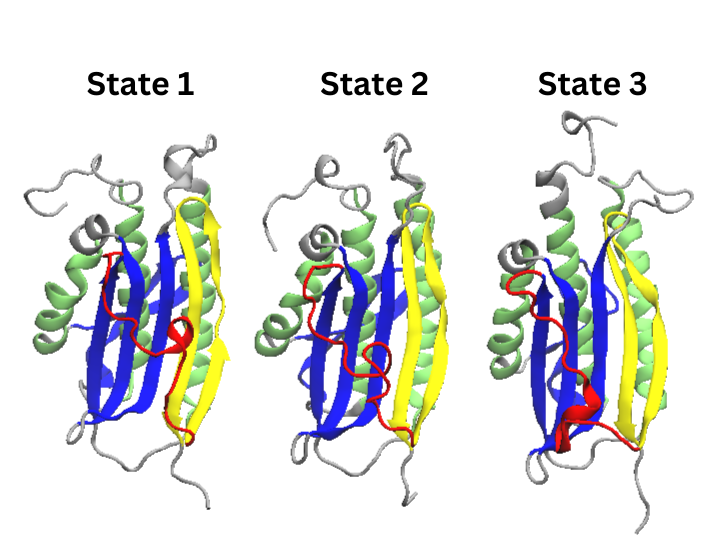
Figure 22. Cartoon Representations of states
extracted from the extended simulation’s PCCA distribution
Conclusion
As with all of the other PDB visualizations, the main
differences between these states is in the formless
red region that become beta pleat 7 in the N1 conformation.
As supported by the colored tICA projections, the most stable state, state 3, has a more alpha helical
structure than the other states.As per the earlier transition graph, the favored transition from state one to state three requires state
one’s helix to transition into a formless state and then turn into the larger helix of state 3.All of the states are of the N2 conformation.
In order to obtain the N1 conformation, it would be necessary to change the experimental
design.
This tutorial has demonstrated a variety of state-based
analytical techniques that can be used to analyze
trajectories, and are especially useful for problems with
associated secondary structure changes. While
the goal
of this case study was to capture MAD2’s ability to access
both the N1 and N2 conformations,
this would be difficult
to do in a short simulation. Moreover, in a real world
experiment, if the N1
conformation was not sampled in
the simulation, it would be beneficial to try other sampling
methods, or to
use alternative analytical methods such as dynamic graphical models or hidden Markov state
models.6
References
Dishman, A. F.; Volkman, B. F. Design and Discovery of Metamorphic Proteins.
Curr Opin Struct Biol 2022, 74, 102380. https://doi.org/10.1016/j.sbi.2022.102380.Chang, L.; Perez, A. Deciphering the Folding Mechanism of Proteins G and L and Their Mutants.
J. Am. Chem. Soc. 2022, 144(32), 14668–14677. https://doi.org/10.1021/jacs.2c04488.Luo, X.; Tang, Z.; Xia, G.; Wassmann, K.; Matsumoto, T.; Rizo, J.; Yu, H.
The Mad2 Spindle Checkpoint Protein Has Two Distinct Natively Folded States.
Nat Struct Mol Biol 2004, 11(4), 338–345. https://doi.org/10.1038/nsmb748.Scherer, M. K.; Trendelkamp-Schroer, B.; Paul, F.; Pérez-Hernández, G.; Hoffmann, M.;
Plattner, N.; Wehmeyer, C.; Prinz, J.-H.; Noé, F. PyEMMA 2: A Software Package for Estimation,
Validation, and Analysis of Markov Models. J. Chem. Theory Comput. 2015, 11(11), 5525–5542.
https://doi.org/10.1021/acs.jctc.5b00743.Polizzi, N. F.; Therien, M. J.; Beratan, D. N. Mean First-Passage Times in Biology. Isr J Chem 2016,
56(9-10), 816–824. https://doi.org/10.1002/ijch.201600040.Olsson, S.; Noé, F. Dynamic Graphical Models of Molecular Kinetics. Proc. Natl. Acad. Sci. U.S.A.
2019, 116(30), 15001–15006. https://doi.org/10.1073/pnas.1901692116.